Mobile browser rendering
Article Retired
This article has been retired, and will not receive any more updates.
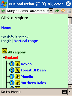
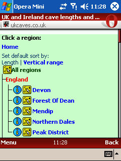
Since writing this article, very little has changed except Opera Mini. Opera Mini 4 for the test device has improved capabilities. It can either render the page as shown here, or very similarly to the Series 60 Browser (see my notes for that device for my opinion of that approach). It still respects handheld media, however, which sets it apart from the Series 60 Browser.
Article
In this experiment, I put several mobile browsers through a series of pages. Sure, some of them are nasty pages, but they are real pages, that browsers should be able to deal with. In many cases, they all rendered pages fairly well, but the Web is not made up of just easy pages. These represent some of the common design types that are in use, and like most real Web pages, not all of them are designed to work with small screens. A good mobile browser will be able to cope with all of them. Let's see what happens.
Where possible, the test platform was Pocket PC 2003, one of the most efficient device operating systems, and a device with (in most cases) plenty of memory to spare (the tests were performed in 2005-2006). The browsers were:
- Pocket Internet Explorer
- The default browser on Windows CE (used on the Pocket PC).
- NetFront
- One of the most popular mobile browsers.
- Minimo (Mini Mozilla - using the same engine as Mozilla and Firefox)
- In development.
- Series 60 Browser
- The new browser used by Nokia on the third edition of its Series 60 handsets. Important; see the note below.
- Konqueror Embedded
- Still in development - for now it seems to be a project designed only to get Konqueror packaged in such a way that it can run on a device.
- OpenWave
- A browser for mobile phones, installed by default on some of them - tested on an emulator set up with the same memory as the Pocket PC.
- Opera
- One of the most popular mobile browsers, and is the default browser on a large number of mobile devices.
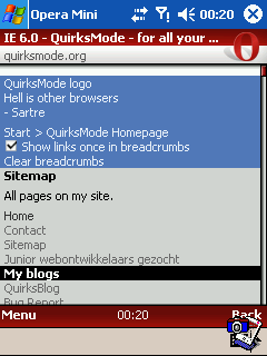
- Opera Mini
- Fairly new, but rapidly becoming one of the most popular mobile browsers, due to the fact that it can run on devices with extremely low resources. It still uses Opera, but it is rendered on a server, formatted using Small Screen Rendering and the rendered page passed to the phone.
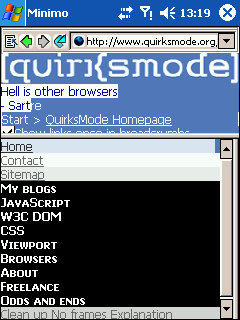
Minimo was by far the worst behaved of all the browsers. It required a whopping 11MB of storage space just to install (that is more than the combined size of all the other Pocket PC browsers), took forever to start, and used up all the remaining 30 MB memory to run, meaning that the screen capture program was unable to run. I had to get a new screen capture program that was much more annoying to use, and on top of that, Minimo ran out of memory and hung several times while loading pages (which it did monumentally slowly). It certainly was not "mini". To be brutally honest, if I did not know any better, I would have thought Minimo was a joke. It is simply too resource hungry to run on most devices.
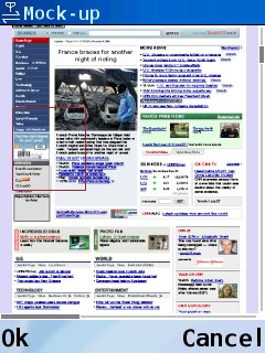
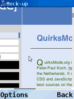
Nokia's Series 60 Browser was not available when I originally wrote this article, so the screenshots were mock-ups made from Safari (the engine used by the Series 60 Browser), and were made in line with the screenshots and flash demonstrations provided by Nokia. It turns out they were surprisingly accurate, with virtually no differences between them and the real pages. Most of the mock-ups are so good that I see no need to replace them with a real screenshot, as they look virtually identical. I did not, and will not, test the older Nokia browser. It does not support tables, makes a mess of even the most basic CSS, and cripples script, so its approach is not to reformat pages, it just forgets to format them in the first place. It is not even in the same class as these other browsers. If you want to see how it looks, disable tables, scripts, and css, then tell your browser to ignore all structural and presentational elements and attributes. Then make your window really small.
Konqueror embedded was available for download, but it refused to compile on either my SuSE or Debian installs, or a friend's Gentoo install. It would not compile on my device emulators either. The pre-packaged binaries were reported as invalid archives, so they also would not run. I did extensive searching, and found many screenshots which showed the overall behaviour, so I made a mock-up that replicated this behaviour, using Konqueror on a desktop.
Note, I did try to test ThunderHawk, but after demanding my life story, it then refused to load any pages at all. For now, its rendering behaviour is supposed to be very similar to the Series 60 Browser (relying on a virtual screen size - see my comments about the Series 60 browser for more details), but it uses server side processing, to compress and format the page. What I can say is that it insists on running in landscape mode, and uses its own virtual keyboard instead of the system one.
Screenshot hosting thanks to Orca.
Note: In most browsers, the screenshots will automatically scale to fit the available screen space. You can click the screenshots to see them full size.
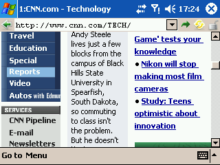
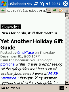
One of the biggest news sites. It is a fairly typical example of a rigid nested table design. Inflexible, cluttered, and certainly not designed to work with hendheld devices. A lot of the styling relies on background images, but is not totally dependent on them. The screenshots concentrate on one specific part of the page, where the use of background images is most apparent.
-
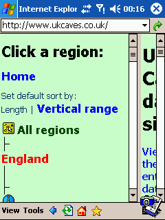
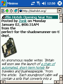
Pocket Internet Explorer
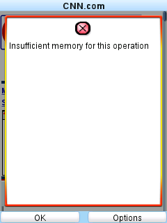
 Even if background images are used, that does not make it look nice. Something has gone very wrong here. I waited for a long time for this page to load, and after all that, it is hardly readable due to some mishandling of backgrounds.
-
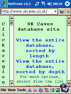
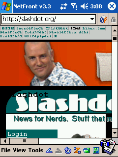
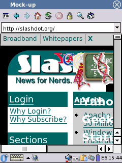
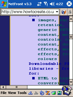
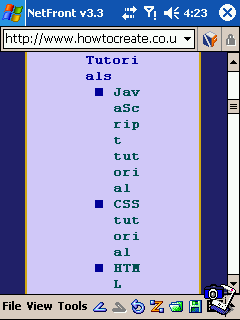
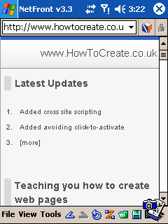
NetFront
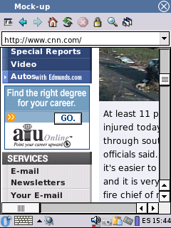
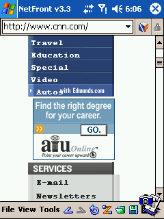 Probably the best looking rendering, NetFront manages to retain more of the original style than the other browsers, for once without producing a horizontal scrollbar (that was a nice surprise). But it took far too long to load. Mobile devices have limited memory, processor power, and bandwidth, and this page took too much of all of them. My device slowed down to a crawl, despite a generous 40 MB of memory devoted to this program. The question is; is the extra bandwidth charges, memory, processor, and load time really worth it? Personally, I prefer something more efficient, even if it does not look so perfect.
 Blazer (which uses NetFront's engine, but runs on Palm OS) proves my point by failing to load the page. It did this on a lot of pages, in fact. Devices find this inefficient approach difficult to cope with.
-
Minimo
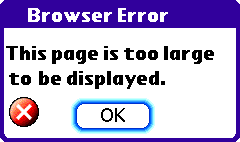
 A thoroughly useless rendering. Minimo fails to complete loading the page. The progress bar continued to show the page as incomplete, no matter how long I gave it. Minimo itself takes up too many resources, and its inefficient approach to page display clearly shows here. It takes a long time to get this much of the page loaded, then it is unable to complete because it requires too much memory.
One good point is that Minimo now hides its tab bar by default. This makes it comparable to NetFront and Opera, which also have the ability to have multiple pages open at the same time (even Pocket IE has an extension to open multiple pages), but do not waste screen space when only one page is open. However, Minimo is so resource hungry that the tabs are useless anyway. I was unable to load two pages at once - it always ran out of memory.
-
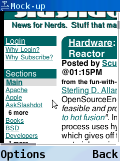
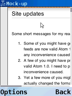
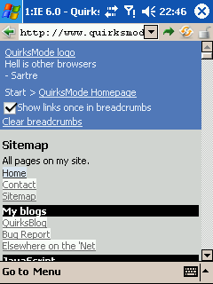
Series 60 Browser
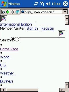
 Different to all the other browsers, the Series 60 Browser shows a thumbnail version of the page, and you scroll to find the part you want. This makes it very easy to skim the page to find the section you are looking for.
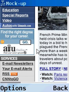 The thumbnail view may be nice, but the zoomed in version certainly is not. The browser does not reformat pages at all, meaning that the page would look "perfect" on a desktop screen. However, the fact is that it is not using a desktop screen. It is using a much smaller screen, and it fails to do anything useful to help you read on it.
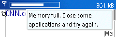 It loads everything a desktop browser would load, meaning it also uses a lot of memory on a device. In many cases, this page made it display an error, then crash the device (I had to increase the emulator memory to make the page display).
-
Konqueror Embedded
 Konqueror is no better. It does not apply any reformatting at all. It behaves exactly like it would on a desktop, with the window shrunk to this tiny size. The result is annoying to read, as you would have to scroll left and right to read each line of text. It also loads everything it would load on a desktop, so on a device, it would probably have the same memory problems that NetFront has. It has a few scripting optimisations, but that will not help when it loads so much unnecessary content.
-
OpenWave
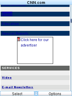 A large amount of the page failed to load, but at least the part I used in the screenshots did. Due to mistakes with both image and CSS handling, the words on the list are almost invisible against their background, and large gaps appear between them.
 OpenWave attempts to load all images and backgrounds, and uses up far more memory than it had available, and more bandwidth than most device users are comfortable with. Before the page could complete loading, it ran out of memory. The device was given the same amount of memory as was available on the Pocket PC, but just running on its own, OpenWave still used all of it. Still, at least it was better than Minimo, since it actually said it had run out, instead of crashing the device.
-
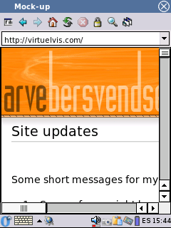
Opera
 I never said it was pretty. Opera's approach of not using background images is obvious, but not bad. The page is still easily readable and clear, and as a result, Opera can get away with using a smaller font than the other browsers, making it more efficient with its use of screen space. It has the additional benefit of lower bandwidth and lower cost. How important that is, is up to your speed and tariff, but in terms of load times, the page would load in about 30 seconds in Opera compared with the few minutes it took to load in the other browsers.
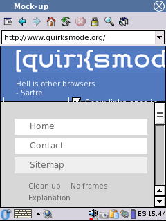
 Opera actually has several reformatting types, and it will pick the best one for the available screen size. If the screen was larger, it would use a reformatting that retained more of the original style, as demonstrated by this landscape screenshot.
-
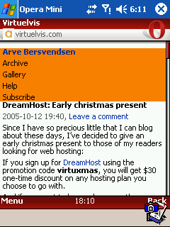
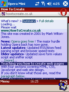
Opera Mini
 Opera Mini's rendering is very similar to native Opera. The page loads very fast, noticeably faster than native Opera. The lower cost is an obvious benefit. The image quality is a little lower, but easily within acceptable limits. On devices with lower memory, the page would be broken into sections to avoid loading it all at once.
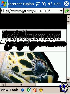
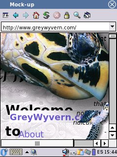
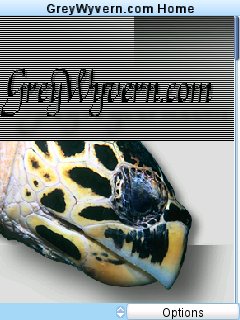
This is a fairly simplistic CSS standards based based page. It has a logo image, and turtle image at the top, including a striped background. The main content is positioned on the left side, with some links on the right. It does not have a handheld stylesheet, but due to the fluid design and lack of complexity, it should be relatively easy for the browser to reformat into something useful for a small screen.
-
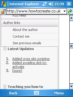
Pocket Internet Explorer
 Pocket Internet Explorer's limitations immediately show. It fails to scale the images, making a horizontal scrollbar appear, and it fails to apply the alpha transparency on the images.
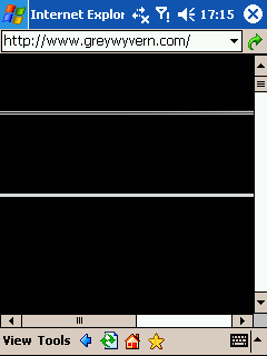 Trying to use the normal transparency fix for IE causes the images to turn black.
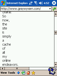 In case you thought it was just the images that looked bad, no. It also screws up the text further down the page, compacting it onto one word per line, and making it totally unreadable.
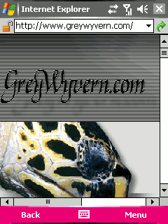 The WM 5 release has managed to gain PNG transparency, so the images look better, but there is still a scrollbar, and the text below is still compacted, and unreadable.
-
NetFront
 Like Pocket IE, NetFront also fails to apply the alpha transparency. To make matters worse, it overlays the images on top of each other, and on top of the content, making parts of the page completely unreadable. Additionally, it also creates a horizontal scrollbar, by failing to scale the images.
Enabling the other reformatting modes breaks the page text into fragments just one or two characters long each, parts of the images disappear, and large gaps appear above the text. (It is possible to make the page readable, by disabling 'Full Browsing' mode, but this will then cripple NetFront on many other sites, as it disables scripting and CSS. I am not impressed with this approach.)
-
Minimo
 Minimo's reformatting stylesheet finally seems to be working. It applies the transparency, and actually has a pleasent rendering of this page. However, it has a few features that make it a little uncomfortable for device browsing. Firstly, it respects background images. That may make it look a little nicer on a desktop screen, but it also makes it harder to read on a device screen. Additionally, it also takes more bandwidth, and results in a slightly higher cost. The italic text is also uncomfortable to read on low resolution screens, meaning that it needs to use a relatively large font to make the page readable. But overall, the page still looks fairly nice.
-
Series 60 Browser
 For once, the Series 60 Browser actually manages to display an entire line of text on one line, without you needing to scroll. It seems to set a virtual width for itself that is wider than the screen, but for once, the main text is kept narrower than it. A rare page that is comfortable to read in this browser.
It also uses a mouse cursor instead of keypad oriented navigation. That is fine on a device that has a stylus, but on a device that uses a keypad, it is a very awkward approach. The cursor and the page scrolling are both cotrolled by the same key, it depends on where on the page it is, and how long you hold it for, as to whether the page moves or the cursor moves. It feels horribly clumsy, and unpredictable. It tries to adjust its position to intersect links, but if a script is used in place of a link, it is hard to get the position right so you can click it. On pages with a lot of links (such as BBC news), it dances around links, and takes a long time to get it to intersect the link you actually wanted to activate.
-
Konqueror Embedded
 Konqueror's approach causes it to obscure everything. In one place, text from 3 different parts of the page is all put into one place, making it impossible to read. The header images are layered over each other, and since they are not scaled, they force a horizontal scrollbar.
Like the Series 60 Browser, it also does not seem to have keypad based navigation (although it should be possible to map a key to the usual 'Tab' function), and several screenshots showed it using a mouse cursor.
-
OpenWave
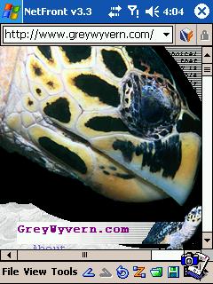
 The background is loaded, and images are scaled so there is no horizontal scrollbar.
 For some reason, there is then a large gap before the top of the page content, but at least after that, the content is reformatted nicely, and is easy to read. Unfortunately, this page is at the limit of the memory capability of OpenWave. Despite having a generous amount of memory, loading this small page sometimes caused it to run out of memory.
-
Opera
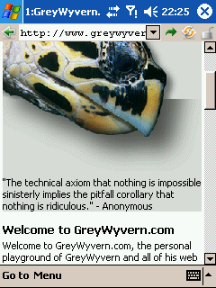 Again, the background image is not displayed, but the colour is retained. This is important to keep the page readable on a small screen, and saves precious (and often expensive) bandwidth by not downloading unrequired images. Opera's approach to reformatting does not force a horizontal scrollbar, while still leaving the text intact, and it is the easiest of all to read. The page still retains the important parts of its distinctive theme. Looks good to me.
-
Opera Mini
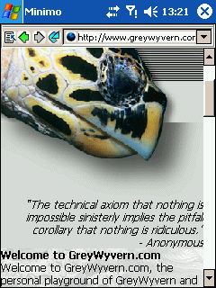
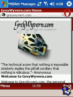 Large images are scaled to the smaller size. This is an option in Opera Mini, and I chose to use the default setting. Since the images here are only decorative, there is no need for anything larger. As with native Opera, the page is very easy to read.
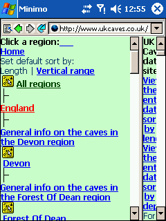
A site I made a while ago when I was still learning how to make Web pages. It uses a simple frameset - and unlike many pages, it actually uses a frameset the way it was supposed to be used. It has a noframes fallback if the browser needs it. The left panel contains all the navigation, and the right panel contains the changing page content. The main page relies heavily on tables, but for the right reason; displaying tabular data, since the site is basically an interface to a database. The left panel also relies on tables, but for the wrong reason; to make the tree structure look right. The page uses CSS media queries to make sure the tables remain functional on a small screen.
-
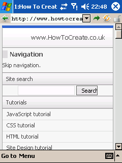
Pocket Internet Explorer
 Despite the obvious lack of screen space, Pocket IE insists on drawing the freameset. In my opinion, it is a very ugly approach. The only way to read the site is to continually drag the frameset around to try to make enough space for the frame you are using. By the tenth time you have struggled to hit the correct 3 pixels (or whatever it is) of dragging space and moved the frames around, you will be fed up with this approach. It is not an efficient use of space or time. As well as the frames approach, it uses fonts that are too big for my tastes, which breaks the left panel, and makes the tables in the right panel difficult to read, even though it does restructure them.
-
NetFront
 Again, NetFront uses a similar approach to Pocket IE, and shows a full frameset. The immediate view looks bad, but NetFront tries to cope with it. Whenever you click on a frame, it is immediately maximised to fill the screen, so it now has enough space. However, now there is no frameset, how do you get back to the other frames? Good question. You use the back button, or you click a link, at which point, the frameset reappears. Defeats the purpose of having frames, in my opinion, but at least it is less frustrating than Pocket IE's approach. Unfortunately, the table restructuring is less useful, and makes the data tables hard to read.
 Blazer (which uses NetFront's engine, but runs on Palm OS) has a better approach, merging the frames into one page. It picks a very large font though, breaking the left panel. I could not get the normal NetFront to produce this frame effect, no matter what options I chose.
-
Minimo
 Minimo uses a similar frames setup to Pocket IE, with a slightly smaller font. The reformatting breaks the table on the left. The frames can now be resized though, so the page can actually be used. It certainly does not look as nice as it could if it had good enough CSS support, but at least you can read it. Another point worth noting is that some of the icon images have failed to load, meaning that Minimo displays the alt text instead. The images failed to load because Minimo ran out of memory, even on this low bandwidth page.
-
Series 60 Browser
 It looks perfect. Exactly how it would look on a desktop. Except that it is on a device, and I am not impressed.
I simply do not like having to scroll left and right just to read one line of text.
It looks perfect. Exactly how it would look on a desktop. Except that it is on a device, and I am not impressed.
I simply do not like having to scroll left and right just to read one line of text.
-
Konqueror Embedded
 Konqueror does not provide a way to disable frames, and it also does not provide a way to resize them. As a result, it is stuck with the right frame being completely inaccessible. The page is rendered useless. I also told it to use a smaller font using a user stylesheet, but it ignored me, so it broke the table in the left panel. Maybe there is a better way in the real Konqueror embedded.
-
OpenWave
 OpenWave cannot view framesets. That is not a bad thing - it runs on very small screens, and does not have any reformatting that can be used for framesets. However, it fails to use the fallback content, deciding instead to show links to the frames. In this case, that does not matter, since the page is designed to allow that, but many framesets are not. This means that OpenWave actually removes any accessible fallback the site provides, making an accessible site potentially inaccessible.
 Viewing the left frame causes OpenWave to run out of memory. How it manages to do that on such a small page is difficult to understand. It fails to load the images correctly, even though there are only 3 images used in total, and the combined size of the images and the page itself is a tiny 10 KB.
-
Opera
 The frames are carefully merged into a single page. Scrolling from the top, there is the left panel, then underneath it, the right panel. It means that each "frame" can use as much space as possible, without disrupting the other frames, and as a result, the page still looks normal, and is easy enough to use. The table in the left panel remains intact, and the entire site can be used by scrolling up and down. The data tables in the right panel are restrustured to fit the screen, it's not as pretty as on a desktop, but it is all easy to read.
-
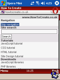
Opera Mini
 Framesets are dealt with in the same way as native Opera. Without the media queries, the rendering is actually a little nicer than in native Opera, but the media queries help maintain a consistent rendering in all browsers that understand them.
One of the most popular Web sites. The bandwidth this site uses is phenomenal, and just by having them link to your site, it can easily be enough to wipe your site out for a week. Take it from my experience ;) Anyway, the site recently underwent a change to make it rely on CSS instead of tables. The page is fairly large, but it is reasonably well structured. Unlike most of the other examples, this page has a handheld stylesheet. It is designed by the author to display the page perfectly on a device with a small screen.
-
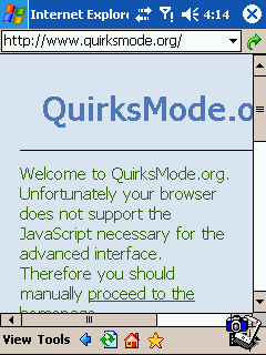
Pocket Internet Explorer
 Despite being around for many years, Pocket IE still does not understand handheld media. The page looks OK. The heading is a bit messy but you can still read. That does not excuse the fact that it is still wrong. In fact, the only reason that this page looks OK is because Pocket IE gets the media types wrong, and applies two of them at the same time, something expressly forbidden by the spec. The second one happens to make the first one look a bit better in Pocket IE.
A browser of this age should be able to understand media types, and it certainly should be able to use handheld media when a page offers it, otherwise it will always be second guessing what the author intended, instead of doing what they asked.
-
NetFront
 Yet another browser that fails to use the correct media type. NetFront applies the (desktop) screen media type. And it suffers as a result. It fails to reformat the page to anything useful.
 Further down the page, the failure to use the correct media type makes a big mess, with the majority of the page content pushed off the side of the screen. Almost the entire page requires you to scroll left and right to read it. Applying the alternative reformatting types does not help either. The content is compacted onto the left side of the screen, one word per line. I dispute the name "Smart Fit".
-
Minimo
 For a browser that is supposed to be good with standards, it is very disappointing to see the wrong media type being used. The reformatting stylesheet does not render the page the way the author intended, and it fails to avoid the horizontal scrollbar, so why not use the handheld stylesheet like it was supposed to? In fact, Minimo actually has to include special hacks for this site to make it display more like the handheld stylesheet would have done. Even so, that is still not good enough; in many cases, a large advert appears at the top of the page, forcing you to scroll down to read the headlines, even though the author told handheld browsers not to display it.
This page was running at the absolute limit of Minimo's memory handling. Each reload caused Minimo to apply less and less of its stylesheets (after three reloads, there was no styling at all). It crashed when trying to load the page without the reformatting stylesheet. It also crashed when trying to unload the page, or load an article. And it crashed when trying to close the program. And generally, it crashed after loading just one or two pages (often requiring a reboot before it would start again). Basically it failed miserably to work within the available memory, even though I was actually able to run the other three Pocket PC browsers at the same time as each other, all with this page loaded. Minimo fails to cope with this page on its own.
-
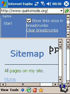
Series 60 Browser
 This browser also ignores handheld media, once again ignoring the work the author has gone to to make it comfortable for small screens. The scrolling problems are still there. Never mind. Switch to thumbnail view and it looks great. Pity it is too small to read.
-
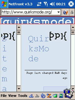
Konqueror Embedded
 Because it does not reformat the page, it ends up with content overlapping everywhere. Most of the page is impossible to read. Other screenshots I found on the Web show that it ignores the handheld stylesheet.
-
OpenWave
 One of very few browsers to do so, OpenWave uses the handheld stylesheet. This is quite rare for OpenWave, since it not only uses it, but actually gets it almost right. Since it always reformats, it makes certain things reappear (such as the little images - in much the same way as Opera Mini does), and does not display the page exactly how it should be. However, the page works the way the author intended, and is comfortable to use.
-
Opera
 Opera's rendering may not appear to retain so much of the page's style, but Opera's rendering is actually by far the best here. Why? Because out of all the browsers, Opera is the only one that is actually rendering the page as the author asked it to. Opera, Opera Mini, and OpenWave use the handheld stylesheet. This is how the author wanted it to look. The other browsers all ignore this stylesheet that they were supposed to use. Instead, they pretend that they are on a desktop computer screen, and apply their cludges to try to make the page look reasonable. None of them displays this page the way they were meant to. This is a major bonus for Opera, and is a good example of how Opera supports more of the CSS standards than any other browser.
Opera has one other trick up its sleeve relating to media types, that makes it work better on more pages than OpenWave's approach. Some pages mistakenly use screen media as a way of saying "not print", so that they can give a different stylesheet to printers. They ignore the other media types - handheld, projection, tv, etc. - completely, meaning that OpenWave will display an unstyled page. When Opera detects that a page has ignored handhelds, it reverts to using screen media instead, reformatting it to fit the screen. In general, this means that Opera manages to retain the theme of much more pages than OpenWave and similar browsers can.
-
Opera Mini
 Opera Mini's reformatting is quite visible. The rendering is noticeably different to native Opera. Font styles are largely ignored, and font sizes are kept small. However, it also respects the handheld media, so it is rendering the page as closely as possible to the author's intentions. The overall effect is very good, and easily readable. This enables Opera Mini to work comfortably on very small screens (as little as 100px wide). On devices with lower memory, the page would be broken into sections to avoid loading it all at once.
Note, I also have a handheld stylesheet on this page. Pocket IE ignores all stylesheets, Minimo ignores the handheld stylesheet, and NetFront randomly picks a few styles from all of the stylesheets and applies them together. By freak chance it actually looks OK, but it would be much better if it just applied the correct stylesheet. If you have Opera, you can try the handheld stylesheet by pressing Shift+F11 (this will enable Opera's handheld preview mode), then change the size of the window to see how it copes at various resolutions.
This site may belong to an Opera user, but don't let that make you think it is biased in any way. This site renders beautifully in all desktop browsers, relying on display:table; for standards compliant browsers, and floats for Internet Explorer. All browsers are given a good chance to render this page, so lets see how the mobile browsers cope.
-
Pocket Internet Explorer
 Pocket IE's mishandling of media shows its ugly head. The page heading and navigation disappear, and the first part of the page mysteriously floats to the right, using only half the screen space, and an awkward small font. Further down the page, mysterious, large, and mis-shapen black blocks obscure parts of the content, making it impossible to read.
-
NetFront
 Trying to retain too much of the original design, NetFront makes a mess of the header, instead of using fallback content. Failing to scale the content, it produces a horizontal scrollbar. The font on the page is far too small, and is virtually (or Virtuelvisly?) impossible to read. Further down the page, some lines of text disappear completely, and are replaced by a blank gap.
-
Minimo
 Minimo does a great job of showing the limitations of a CSS based approach. Always trying to second-guess what the author will have used, it completely fails to cope with the display:table; and ends up with two uncomfortably narrow columns of text. There is such a thing as retaining too much of the original theme, and this is it.
This CSS based approach has some other serious limitations. For example, if dark text is written on a layered light background, with a further dark background behind it, the text will disappear. Of course, this is not recommended, but that never stopped anyone from doing it, and it does occur on real Web pages (MSN Japan used to do this, for example). Browsers that use a reformatting algorithm, like Opera, can adapt the content, and adjust colours if they do not contrast enough with their background.
-
Series 60 Browser
 For some reason, the KHTML engine misplaces the header and puts it at the bottom, so the page looks wrong. This problem can also be seen in desktop browsers that use the same engine. But to be honest, you will be much more frustrated when you try to read the page. Try playing with the back button instead, it's got a cool animation. Very distracting.
-
Konqueror Embedded
 The engine I used has a fix for the misplaced header, so the page looks right, but now it is stuck with having a horizontal scrollbar, making reading the page very uncomfortable. This browser does not seem to have many features that make it useful for mobiles.
-
OpenWave
 OpenWave decides it does not like the style, and ignores it completely. This is due to some serious bugs in its use of CSS, that makes it ignore a large number of CSS rules, or their selectors. The page is readable, but unstyled, and the site's theme is lost.
-
Opera
 Opera renders the site very well. The background image (which is not required) is not shown, and instead, the fallback content is used, retaining the theme of the site, but making it perfectly readable. The use of screen space is efficient, and very comfortable to read.
-
Opera Mini
 Opera Mini's rendering actually seems a little nicer than native Opera's, because of the way it renders the list at the top. The font formatting is a little less ornate, but aside from that, the rendering is very similar, and easily readable.
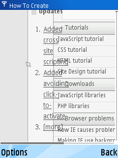
One of the biggest Web development reference sites. Its design is based on a frameset. There is a top frame for the logo and a breadcrumb script, a left frame for the navigation, and a main right frame for the content. The page does not use the normal frameset approach. Instead of a noframes section, it has a complete page, and uses a script to generate the frameset only if the browser is capable of running the scripts used by the navigation page. Without frames, the browser is given an alternative view of the navigation, leaving the site fully accessible. As an additional bonus, the scripting design allows the frameset to be bookmarked, so that it will return to the correct pages within the frameset.
-
Pocket Internet Explorer
 Pocket IE shows off the low quality of its scripting engine and does not generate the frameset. Oh well, at least this site is accessible. The logo font is not scaled, producing a horizontal scrollbar. Pocket IE on Pocket PC 2003 has no DOM, DHTML, or RegExp capabilities, leaving the scripting engine capable of doing virtually nothing useful. The WM 5 release has some RegExp capabilities, and supposedly it has DHTML too, but it fails on even the simplest tasks, since it does not support any of CSS 2.
 By adjusting the script, it is possible to make the frameset appear in Pocket IE. The navigation script fails (which is why the script - sensibly - did not create the frameset originally), and navigating the page once again relies on dragging the frames around repeatedly. This is one occasion when you will be thankful that the scripting engine is so poor, because you will be spared the horrible frameset handling.
-
NetFront
 NetFront claims to support the required scripting, so the page generates the frameset. However, NetFront's scripting support is actually very poor, so it fails to run the navigation script. Now stuck inside a frameset, the page on the left side is not created properly, and is left with a malfunctioning frameset. By using only the left frame, it is possible to use the site, but it is not very convenient or comfortable, as the useless frameset keeps re-appearing when you click links. To make matters worse, NetFront picks very small fonts for parts of the page, making them impossible to read. Other parts of the page use fonts that are too big, and words are broken into fragments, with one letter on each line. The site is almost impossible to use.
In the latest release, NetFront crashes whenever it tries to render this site. The screenshot was taken in a slightly older release (the capabilities have not changed).
-
Minimo
 Minimo runs the script and generates the frameset. The site is now usable at least, but viewing it relies on dragging the frame to the right, clicking a link, then dragging it to the left to read the page, repeating this whenever you want to view something else. This approach would not be suited to devices without some form of pointing interface, and even on devices that do have a pointing interface (such as the Pocket PC), it is still quite frustrating to use.
-
Series 60 Browser
 I am afraid that I have run out of polite ways to say how much I dislike this approach to mobile browsing.
Ok, I will try to point out something constructive. Because most of the pages on this site do not force certain widths on elements like paragraphs, several of them are allowed to resize as needed. The Series 60 Browser takes these elements, and restricts their widths to a little less than the width of the screen. This means that in many cases, you do not have to keep scrolling left and right for each line of text. This is a bit hit-and-miss, and does not work reliably on many sites, but it does work on several parts of this site.
However, it forgets to take any margins into account. Pages like these that use indented elements suffer very badly from this. This means that any blockquotes, bullet/numbered lists, definition lists, custom margins, and various designs need you to keep jumping left and right for each indent. Because of the clumsy scrolling/pointer handling, this is difficult to get right as it keeps jumping too far one way or the other, cutting off parts of the text. It is certainly not something you would want to do for long.
-
Konqueror Embedded
 The response is almost identical to Minimo, except that the right frame has disappeared and cannot be accessed, since the frames cannot be resized. The page is impossible to use, since links in the left frame open in the invisible right frame.
-
OpenWave
 According to one press release, OpenWave supports scripts. According to reality, it does not. At all. The browser completely ignores scripts, crippling it on a large number of sites. At least this site remains accessible, and can be used via fallback content. OpenWave also does not scale the large font, needlessly breaking the heading into fragments.
-
Opera
 Opera gracefully deals with the frameset, merging it into what looks like a single page, with the top frame first, then the left frame underneath it, and the right frame underneath that. The entire site works very well this way, and the overall theme is retained very well.
-
Opera Mini
 The rendering is very similar to native Opera, and the site performs without any major problems. The frameset is removed when clicking links, meaning that you have to go back to see it again. This can be a little annoying, but on the low resource phones that Opera Mini is designed for, having a smaller page can be welcome. The history performs fast enough, so going back is not too uncomfortable.
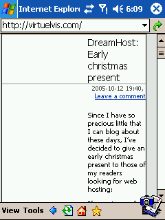
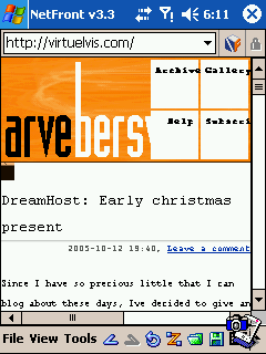
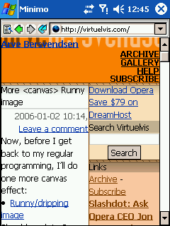
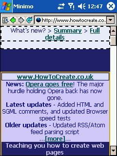
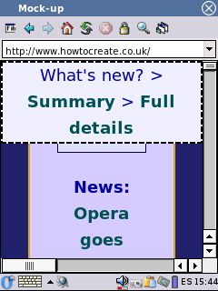
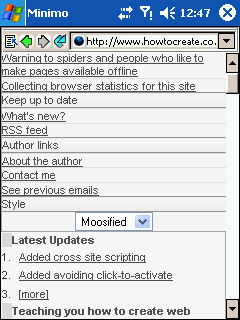
You may be familiar with this page. It is a simplistic design based on borders and colours. Margins are used to make the page appear centred, while still remaining fluid. The page uses CSS for the design, and does not rely on tables. This design is very simple, and should be easy for browsers to cope with, and reformat as needed.
-
Pocket Internet Explorer
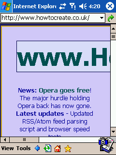 For some reason, Pocket IE seems to be unable to scale fonts or paddings. This is a fairly big shortcoming. The heading disappears off the side of the screen, producing a long horizontal scrollbar. The unscaled padding gives the content of the page very little space to work with, and the page is left with only a few words per line. The use of screen space is certainly not efficient. The script that generates the "What's new" section is unable to run due to the limitations of the scripting engine. (There is still an accessible link further down the page, so don't get upset with me.)
-
NetFront
 NetFront is like an extreme version of Pocket IE. It also does not scale fonts or paddings, but on top of that, it also does not scale margins. The page is left with even less space, and is very uncomfortable to read.
 Further down the page, it fails to keep the content within the readable area of the page, overflowing the edge of the box. There is nothing in the stylesheet that tells it to do this. This produces a horizontal scrollbar, and makes most of the content unreadable.
 Enabling Smart Fit does not fix anything. Large fonts, margins, and paddings are still not scaled. All that happens is that the text is now broken into fragments 3 letters long, and positioned stupidly in the middle of a wide, blank gap. The page is totally unreadable.
-
Minimo
 Minimo retains the original theme of the page, while reformatting it to fit the screen. There is an odd gap at the top, but the page works very well, and it is comfortable to read.
-
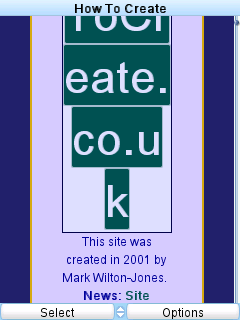
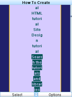
Series 60 Browser
 Once you have zoomed in and out 10 times to find what you want, the novelty of the thumbnail view has worn off. Now you need to read the page. It will not be long before scrolling left and right becomes incredibly frustrating. The other browsers have invested a lot of time to produce a rendering suitable for small screens (some with obviously more success than others).
The Series 60 Browser seems not to understand why they all put so much effort into it. Cool tricks will simply not cut it here. This approach makes the page extremely frustrating to read.
-
Konqueror Embedded
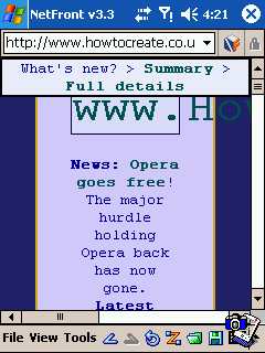
 This is one of the few pages that it was actually possible to read without scrolling horizontally. The heading is not scaled (even though I tried to make it scale using a user stylesheet), and neither are the margins and paddings, so there is a scrollbar. The header is obscured by other content. The rest of the text is mostly shown with one word per line. However, the heading is not all that important, and at least the page can be read.
-
OpenWave
 OpenWave's reformatting fails to scale the font or the margins and paddings. The page content is compacted into a narrow column in the middle of the screen, with the heading broken into fragments.
 Further down the page, the rest of the content is also broken into fragments, and the page is unreadable and unusable as a result.
-
Opera
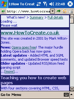 Opera deals with this page very well. It retains the important parts of the theme, and uses screen space very efficiently. It is almost as comfortable as using a desktop screen.
-
Opera Mini
 A little more of the original theme is lost, but it is still easily identifiable. The page remains very easy to read and use.
There is also the new design for the site, fairly typical CSS based, with a navigation panel on one side. It uses handheld media and media queries to help the page display on a complete range of screen sizes, and of course; handhelds.
-
Pocket Internet Explorer
 The new design seems works much better than the old one. Pocket IE does not use the handheld media, and instead relies on its reformatting. By default, the main content is compacted onto one word per line, but single column mode (shown here) works better, with the navigation put first (as it is first in the markup, followed by the main content. There is a strange gap down the right side, and a similar gap to the left of the links in the navigation panel. Overall, however, it is not bad, and can be used comfortably.
-
NetFront
 The new design seems to be reformatted better than the old one, since nothing is compacted, and there is no horizontal scrollbar.
However, NetFront has some serious problems with media types, and applies some styles from print media (apparently it thinks a mobile phone or PDA is a printer). The navigation panel has disappeared completely, so most pages on the site cannot be accessed without typing their addresses by hand. All reformatting modes produce the exact same output, and the site is rendered completely useless as a result. And all because Netfront chooses to ignore the handheld stylesheet.
The new design seems to be reformatted better than the old one, since nothing is compacted, and there is no horizontal scrollbar.
However, NetFront has some serious problems with media types, and applies some styles from print media (apparently it thinks a mobile phone or PDA is a printer). The navigation panel has disappeared completely, so most pages on the site cannot be accessed without typing their addresses by hand. All reformatting modes produce the exact same output, and the site is rendered completely useless as a result. And all because Netfront chooses to ignore the handheld stylesheet.
The page offers the option to disable the theme stylesheets (not the ones used for demonstrations), but NetFront is unable to run the script that disables them, and even if it could, the options are put on the hidden navigation panel. You will need to tell NetFront to use "text browsing" mode - none of the demonstrations will work, but at least you can read the page, and access the navigation links.
 If the missing navigation is not bad enough, the text justification causes the words to be needlessly broken at the ends of lines, and scrolling can also cause some unsightly display corruptions.
-
Minimo
 Minimo ignores the handheld stylesheet in the new design, relying again on its reformatting stylesheet. It removes a little too much padding for my tastes, and the navigation panel looks very cluttered with lines everywhere. However, the main content is at least readable, and quite comfortable to use.
-
Series 60 Browser
 The new design fares even worse than the old one. Because it does not impose a fixed width, the browser assumes it will fit in a width of 416 pixels (nearly twice the width of the screen), then renders it assuming it was on a desktop display. Text overlaps, and is compacted into a narrow column. The CSS has handheld media and media queries to allow it to reformat nicely for small screens, but both of these are ignored, and the page is left unreadable. The page would have displayed properly on the screen without any horizontal scrollbar, overlaps, or compacting at all, if the browser had used the CSS it was supposed to use.
The page offers the option to disable the theme stylesheets. You will need to use this if you want to be able to use the page.
-
Konqueror Embedded
 The new design suffers similarly to the old one. Because Konqueror Embedded ignores the handheld stylesheet, the navigation is too wide, and forces a scrollbar. The main content has the opposite problem, as it is compacted into one word per line. The page is readable, but very uncomfortable.
The page offers the option to disable the theme stylesheets. You will probably want to use this if you want to be able to use the page comfortably.
-
OpenWave
 Although this page has a handheld stylesheet, which OpenWave supposedly understands, it fails miserably to use it properly. All headings are shrunk to a tiny, unreadable (almost invisible) size, but with a big gap left around them. Due to serious problems with its CSS handling, it ignores large parts of the stylesheet, meaning that list items have completely wrong styles, and large parts of the site suffer from similar problems. Most of the content is still readable, but without visible headings, it can take a while to work out what parts of each page relate to what topic.
-
Opera
 With the new design, Opera uses the handheld media and the media queries, and displays the page absolutely perfectly. Exactly the way the handheld stylesheet asks it to (so any perceved imperfections are the fault of the stylesheet, not Opera). As a result, the page works correctly, the style is maintained, and it is the most comfortable of all the browsers to use. Even the stylesheet switcher works, so you can choose from a selection of available handheld stylesheets.
-
Opera Mini
 With the new design, Opera Mini uses the handheld media and media queries, so its basic rendering is the same as normal Opera. However, it then reformats the page to make sure it will fit on the smallest screens. In this case, there is no need to, and it would be nice if it could retain a little more of the original style. However, the page remains comfortable to use, and the important parts of the theme remain.
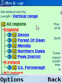
This is Microsoft's own site, documenting the capabilities (or lack of capabilities) of Internet Explorer. It is based on framesets, that it enforces very heavily. It is not possible to view the site without framesets. The layout uses 6 rendered frames (in 4 separate framesets); one at the top for the logo and menus, one on the left for the search field, one under it for the "sync toc" function, one under that for the tree structure, then a small frame on the right for the words "Welcome to the MSDN Library", and finally, a main frame under it for the content.
Note that this page serves garbage to Opera (and possibly other browsers) if it identifies as itself, so Opera has a user-agent override set on this site to make the site think it is something else.
-
Pocket Internet Explorer
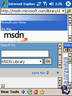 You would think that Pocket IE would be able to render Microsoft's own site properly, especially the parts about IE. But no. Pocket IE's frameset approach is absolute Hell on this page. The clumsy frameset handling simply cannot cope. There is no option that can make this page look good in Pocket IE.
-
NetFront
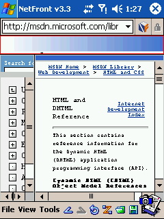 NetFront still insists on using a full frameset, but at least you can select and maximise different frames easily. That does not stop it being annoying of course. The content of some of the frames is completely obscured, and difficult to access. To make matter worse, the font chosen by NetFront has to be the smallest I have seen on a device, and is completely impossible to read.
-
Minimo
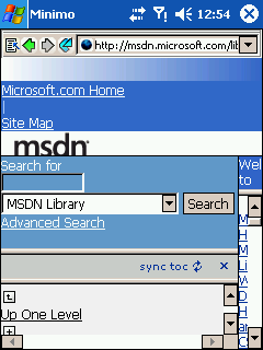 The frameset is rendered, and the pages are all too small. Some of them can be resized, but not the most important one of all - the actual information you want to read. The content is impossible to see. It seems Minimo does not want you to read about their competition.
-
Series 60 Browser
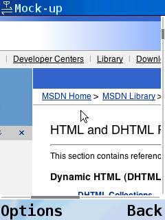 The good point is that it will be very easy to navigate between frames, and the thumbnail view would do a lovely job with this page. Trying to read would still be clumsy, but the overview would be welcome in Pocket IE and NetFront.
-
Konqueror Embedded
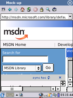 The frames are rendered as a complete frameset. As long as you have a mouse, it is possible to change the size of the frames a little, so that the frame with the main content has enough space for just one or two words per line. However, most of the content is still invisible, and completely inaccessible. Also, it is difficult or impossible to change the size of the frames back again after making the right frame larger. The page remains almost impossible to use.
-
OpenWave
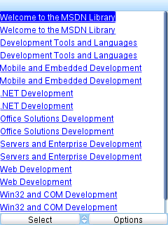 MSDN sends a garbage page to OpenWave. This is not OpenWave's fault, it is the fault of the ignorant Web site administrators. However, it does not matter anyway, since OpenWave could not display the frameset, even if it was given it, and the site is unusable without the frameset. OpenWave could not use this site.
-
Opera
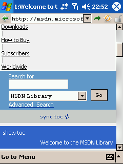 Even with a page that is so horribly designed, Opera's approach is surprisingly good. Again, the frames are merged, one after the other. The page remains very easy to use, and along with Opera Mini, this is by far the best of the browsers tested. The native Opera has a small problem with frame ordering when running external programs, so taking screenshots may cause the frames to change sequence. This is a bug in the 8.5 engine used in this release, and is fixed in later versions of the engine (this problem does not occur in Opera Mini).
-
Opera Mini
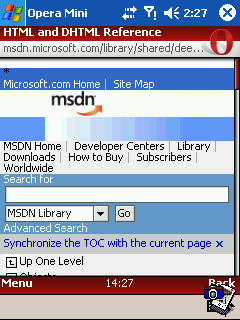 The formatting is a little less ornate than in native Opera, and the reduced quality on the images is a little more obvious. The rendering is also a little more compact, but the site is just as easy to use.
Conclusion
Well, it does not take too much effort to realise that only two browsers successfully coped with all the pages, and they share a common name. I am quite sure there will be some that defeat Opera, probably ones that really rely on desktop screen size to work (such that they will not let you continue unless your screen is a certain size), or pages that deliberately sniff and block it, or maybe ones that rely too heavily on use of plugins. But in general, Opera seems to cope with difficult pages far better than the other device browsers.
Add in it's impressive capabilities, such as its ability to use XMLHttpRequest (AJAX) applications, and its very good support for standards such as DOM, CSS (even particularly useful things for devices, like media queries, and the obviously important handheld media), and SVG. Its low resource usage, and small footprint are also very important benefits. All in all, Opera manages to outshine the other device browsers.
See disclaimer
Back to Opera resources | Back to How To Create